There is a debate that has run through Formula 1 for decades, resurfacing whenever a dominant driver wins another championship: how much of that success belongs to the driver, and how much to the car?
The most common version of this argument targets Lewis Hamilton. Seven world championships, 103 race wins — but was he truly the greatest driver of his generation, or was he simply the beneficiary of the most dominant car in the sport’s history? Fans of Fernando Alonso, in particular, have argued for years that had the Spaniard been given the same machinery, the story might have looked very different.
You cannot answer this by looking at the championship standings. In Formula 1, the car is not a constant — it is arguably the single biggest variable on the grid. Two drivers on the same grid are not competing on equal terms. They never are. That is what makes F1 uniquely difficult to analyze and uniquely interesting to try.
This project attempts to answer the question properly, using a Bayesian hierarchical model to isolate each driver’s individual contribution to race outcomes after controlling for the car they drove.
A Quick Primer on How F1 Works
If you follow F1 closely, skip ahead. For everyone else, here is what you need to know.
Formula 1 has two layers of competition: constructors (the teams that build the cars) and drivers (the people who race them). Each constructor fields two drivers per race. The championship is contested by both — there is a Drivers’ Championship and a separate Constructors’ Championship.
The critical point is this: the car matters enormously. Unlike football, tennis, or basketball, where the equipment is standardized, each F1 team designs and builds its own car to its own specifications. In any given season, one or two teams will produce a car that is simply faster than everyone else’s. The drivers in those cars will win races not necessarily because they are better drivers, but because they are in better machinery.
To illustrate how much this matters: this model found that the 2022 Red Bull had a team-season effect of -1.93 — meaning their car alone finished nearly 2 positions better than the starting grid historically produces. Before Max Verstappen or Sergio Perez did anything at all, the car was already doing the work. More on what that number means shortly.
This is the problem. And it is why simply counting wins and championships is a poor proxy for driver skill.
The Approach: Measuring “Value Added on Sunday”
The core idea behind this model is to stop asking “where did the driver finish?” and start asking: did the driver finish better or worse than we would expect, given where they started?
Think of it as measuring not the result, but the surprise in the result. We call this the driver’s “Value Added on Sunday” — how much better or worse did they perform relative to what their starting position and car would historically produce?
Step 1 — The Expected Finish Benchmark
For each starting position (1st through 20th) in each season, we compute the historical average finishing position for all drivers who started from that slot that year. This becomes the benchmark — what a typical driver in a typical car historically does from that grid position in that specific season.
For example, in 2023, the benchmarks looked like this for a few key grid slots:
| Starting Position | 2023 Expected Finish |
| P1 (1st) | 1.62 |
| P8 (8th) | 8.76 |
| P15 (15th) | 10.69 |
| P20 (20th) | 14.33 |
Notice that P20 expects to finish around P14 on average — this reflects the reality that a significant number of cars retire or get passed throughout a race, so starting last does not mean finishing last.
The benchmark is computed within each season, not pooled across all years. A 7th place (P7) starting position in 2014 is a completely different competitive reality from P7 in 2023. Pooling them would introduce era-blending bias before the model even runs.
Step 2 — The Residual
Once we have the benchmark, we compute a number called the residual — the gap between what happened and what we expected — for every driver in every race:
finish_residual = finishing_position - expected_finish
A negative residual is good — the driver finished better than expected. A positive residual is bad — they finished worse.
A concrete example using real 2023 data:
Verstappen, Round 1 (Bahrain): Starts P1, finishes P1. The 2023 benchmark for P1 is 1.62, so his residual is 1 − 1.62 = −0.62. A small negative — he did what was expected, with a slight outperformance.
Perez, Round 3 (Australia): Starts P20 (last place), finishes P5. The 2023 benchmark for P20 is 14.33, so his residual is 5 − 14.33 = −9.33. A massive negative — he dramatically outperformed what anyone starting last would historically achieve.
Both drivers are in the same Red Bull. The car did not explain the difference between these two residuals. Something else did.
Step 3 — Separating Driver from Car
Here is where the model comes in. A raw residual still contains two signals mixed together — what the driver contributed and what the car contributed beyond the benchmark. These need to be separated.
A fast car does not just show up in qualifying pace — it also shows up in race pace above qualifying. In 2023, Red Bull did not just qualify near the front; they also consistently converted good starting positions into even better finishing positions. The benchmark for each grid slot is computed from all cars that ever started there, including those that finished in the midfield. So a dominant car starting P2 and finishing P1 still generates a negative residual, because the P2 benchmark includes every midfield car that has ever started second and typically fallen back.
This is why the model includes a TeamSeason Effect — a per-constructor, per-season term that absorbs the residual car advantage the benchmark did not fully capture. Only after accounting for both the benchmark and the team-season effect does the remaining signal get attributed to the driver.
In the 2023 example above, Red Bull’s TeamSeason Effect is −1.21. That means approximately −1.21 of every driver’s residual that season is attributable to the car’s race-pace advantage above what the qualifying position already captured. The remaining residual — after subtracting the car’s contribution — is what the model calls the Driver Effect.
The Model Structure
The model decomposes each race residual into three components. In plain English:
- How good the driver is — their consistent tendency to over or underperform their grid slot across their career
- How good the car was that season — the constructor’s race-pace advantage in that specific year, above and beyond what qualifying position already captures
- Whether the driver crashed out through their own fault — an explicit penalty for driver-fault retirements
The math, for those interested:
finish_residual ~ StudentT(ν, μ, σ)μ = α + Driver_Effect + TeamSeason_Effect + β_dnf × dnf_driver_fault
The model is hierarchical — meaning driver effects and team-season effects are estimated jointly, each informing the other. A driver’s effect is not estimated in isolation; it is estimated in the context of every team they drove for and every season of data available. This structure lets the model share information intelligently across the dataset rather than treating each driver-season combination as completely independent.
Why StudentT and not a standard bell curve? F1 race residuals have what statisticians call “fat tails” — extreme outcomes, like finishing 10 places better than expected, happen more often than a standard bell curve would predict. Safety cars, first-lap incidents, and rain races all create these extremes. A standard Gaussian (bell curve) model would over-fit to these outliers, pulling every driver’s estimated effect in misleading directions. The StudentT distribution — a version of the bell curve with heavier tails that expects surprises more often — handles these robustly without discarding them. The model learned from the data itself that ν (the parameter controlling tail heaviness) is approximately 3.5 — confirming that F1 results are genuinely extreme relative to what a normal distribution would expect.
Why Bayesian?
A standard regression model gives you one number per driver — a point estimate. A Bayesian model gives you a probability distribution — a full range of plausible skill levels, each with an associated probability. This distinction matters for two reasons.
First, it handles uncertainty honestly. Lewis Hamilton has 243 races in this dataset. The model has a lot of data, and its estimate of his skill is tight. A rookie with 21 races gets a much wider range — the model is saying “we don’t have enough data to be confident yet.” A traditional model treats those two estimates as equally reliable. This one does not.
Second, it enables statements that are simply not possible with conventional rankings. Instead of saying “Hamilton is ranked 1st,” the model says: “There is an 85.2% probability that Hamilton’s true driver effect is better than Verstappen’s on this metric.” That is a fundamentally more honest and more useful claim.
Key Modeling Decisions
Every model involves choices. Here are the ones that shaped this analysis and why they were made.
Season-level team effects, not career-level. Red Bull in 2023 — when they won 21 of 22 races — is a fundamentally different entity from Red Bull in 2019. Treating them as one static coefficient would absorb that variance in the wrong place. Season-level indexing lets the model accurately track each constructor’s year-by-year arc.
Zero-sum constraints on both effect sets. Both Driver Effects and TeamSeason Effects are constrained to sum to zero across their respective groups. This prevents the two sets of effects from drifting against each other, rendering interpretation meaningless. Every driver comparison is expressed relative to the grid average driver. Every team comparison is relative to the average constructor-season.
DNF classification via manual audit. FastF1 provides raw status strings for every retirement. These are inconsistent across 11 seasons of data and sometimes ambiguous. Every status string was manually reviewed and assigned to one of four categories: finished, driver-fault, mechanical, or ambiguous. Driver-fault retirements (crashes, spins, collisions) carry an explicit penalty in the model. Mechanical retirements do not — a driver should not be penalized for their engine failing. The 140 rows labeled simply “Retired” with no further detail were excluded rather than misclassified. Losing 3% of the data is preferable to introducing systematic misattribution.
20-race minimum for the final rankings. The model includes all drivers in the fitting process, but the final rankings plot only shows drivers with at least 20 race starts. This decision was validated during development: Franco Colapinto ranked in the top 5 in early model runs after just 6 races (mean residual −1.94), but settled to average after 23 races (mean residual +1.31). Small samples produce wide, unstable estimates. The 20-race threshold keeps the headline output honest. Drivers near that threshold — rookies or those with short careers — will carry wider uncertainty bands than veterans. Treat their rankings as directional, not definitive.
The Findings: Driver Rankings
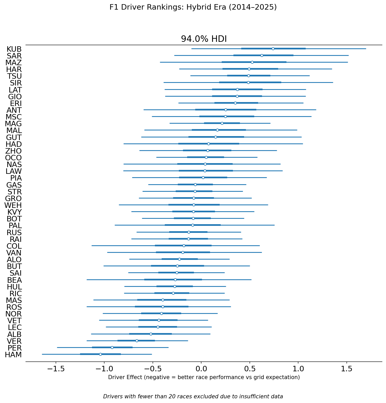
Each bar represents a driver’s posterior distribution — the range of plausible values for their true driver effect, given all the data the model has seen. The dot is the median estimate. The thick inner bar is a 50% credible interval—the range where the model believes the true effect most likely lies. The thin outer line is the 94% credible interval — meaning the model is 94% confident the true value falls within that range. Drivers on the left side of zero consistently outperformed their grid slot. Drivers on the right consistently underperformed.
Notice how interval widths vary. Hamilton and Verstappen — with 243 and 249 races respectively — have tight, narrow intervals. The model is confident about them. Drivers near the 20-race cutoff have wide intervals spanning much of the chart. Their rankings are real estimates but carry far more uncertainty.
Hamilton at the Top
Hamilton sits at the top with a driver effect of roughly −1.5 positions — meaning on average he finishes about one and a half places better than his starting grid position would historically predict. The model estimates an 85.2% probability that his true driver effect is better than Verstappen’s on this metric.
This result holds up to scrutiny. Hamilton’s career is not just a story of dominant machinery. He won his first championship in 2008 in a McLaren that was not the fastest car that year. His 2022 and 2023 seasons — when Mercedes produced an uncompetitive car — showed a driver still extracting everything available, just with less to work with.
The comparison with Alonso is even starker: 98.6% probability that Hamilton’s driver effect is better. This is the strongest pairwise probability statement in the dataset. Hamilton has significantly more data (243 races vs. 201 for Alonso) and has shown more consistency across varied car quality. Whether that fully settles the debate between them is for the reader to decide — but it is not a number to dismiss lightly.
The Verstappen Paradox
The model ranks Sergio Perez 2nd and Max Verstappen 3rd. The model gives only a 21.4% probability that Verstappen’s driver effect is better than Perez’s. To anyone who watches F1, this immediately raises a flag — Verstappen has dominated Perez comprehensively across every real-world metric.
This result is not a modeling error. It is the most important finding in the project and reveals a fundamental truth about what this metric actually measures.
We are not measuring “who is the fastest.” We are measuring “who adds the most value relative to their starting position.”
Return to the real 2023 examples from earlier:
Verstappen, Bahrain: Starts P1, finishes P1. Residual: −0.62. The model sees a small outperformance.
Perez, Australia: Starts P20, finishes P5. Residual: −9.33. The model sees a massive outperformance.
Both drove the same car that weekend. Both had the same Red Bull TeamSeason Effect of −1.21 working in their favor. After accounting for the car, Perez’s Driver Effect contribution in Australia is enormous. Verstappen’s in Bahrain is modest.
This is not an isolated example — it reflects a well-known pattern in Perez’s career. He frequently qualifies below where his race pace suggests he should be, then recovers positions on Sunday. That pattern is exactly what this metric rewards. Verstappen’s dominance in 2022–2024 involved many weekends of pole-to-win perfection. And perfection from the front generates near-zero “Value Added on Sunday.”
To show the model is not blind to Verstappen’s talent: in Round 2 of 2023 (Saudi Arabia), he started P15 after a qualifying problem and finished P2. His residual that weekend was −8.69 — one of the strongest single-race Driver Effect contributions in the dataset. The model sees and rewards that performance. It simply cannot reward the many weekends where he started first and finished first.
This is a structural property of residual-based ranking, not a flaw. Any metric built around finishing relative to starting position will have this characteristic. It is fully acknowledged — and is the primary motivation for the Version 2 model described at the end of this article.
The Interesting Middle
Alexander Albon at 4th is the most interesting result for anyone who follows F1 closely. Albon is not a name that appears in most GOAT debates. But across 114 races — primarily in the Williams, one of the slowest cars on the grid — he has consistently finished better than his grid slot expected. The model is picking up something real: Albon is widely regarded within the paddock as a driver who maximizes an underperforming car, and the numbers confirm it.
Alonso vs. Ricciardo (42.2% probability Alonso is better) is one of the most honest results in the dataset. These two drivers have been compared by fans for years — similar eras, similar peaks, both regarded as elite talents who perhaps never got the machinery to prove it definitively. The model’s answer: they sit within each other’s 50% credible intervals. Statistically indistinguishable on this metric across their careers. Whether that satisfies either side of the debate is another matter.
Norris vs. Leclerc (45.9%) tells a similar story for the current generation. The two most hotly debated young talents in F1 right now, and the model cannot separate them with any confidence. Both are elite. Any ranking between them at this point is noise.
The Bottom Tier
Kubica, Sargeant, Mazepin, and Hartley cluster at the bottom — consistent underperformance relative to their grid slots across their careers. This broadly aligns with the F1 community’s consensus view on these drivers, which is a useful sanity check: a model that produced nonsensical results at the bottom would be hard to trust at the top.
The Findings: Constructor Dominance
These team-season effects are exactly what the model subtracted out to isolate driver skill. They represent how much each constructor’s car finished better or worse than the qualifying position alone would predict, season by season.
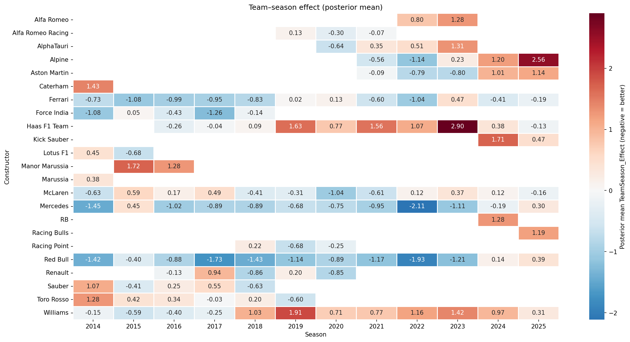
Each cell shows the posterior mean TeamSeason Effect for a constructor in a given year. Blue means the car finished better than expected relative to its qualifying position. Red means worse.
A few stories jump out immediately:
Mercedes entered the Hybrid Era in 2014 with a −1.45 effect and sustained dominance through most of the decade, peaking at −2.11 in 2022 — the darkest blue on the chart. Their fade to +0.30 in 2025 tells the story of a team that built its advantage around a specific set of technical regulations and lost that edge when the rules changed.
Red Bull shows two distinct peaks: the 2014–2017 era and the 2021–2023 era, with 2022 (−1.93) representing the apex of their dominance. Their 2024 and 2025 values suggest the competitive window is closing.
Williams from 2018 onward is a sustained red streak — the most visually obvious decline arc in the dataset.
McLaren’s arc from −0.63 in 2014 through the difficult 2017–2020 period and partial recovery is visible across the row — a team that lost its way and slowly found it again.
Haas 2023 (+2.90) is the single worst team-season in the dataset. Alpine 2025 (+2.56) is a close second.
One result worth flagging directly: Ferrari appears to outperform McLaren in 2025 on this metric, despite McLaren being widely regarded as the faster car that season. This is the same structural property that produces the Verstappen Paradox, now showing up at the constructor level. McLaren qualified on average P3 in 2025 and finished P3 — the model sees no surprise. Ferrari qualified P7 on average and finished P6 — the model rewards that consistent outperformance of grid position. By absolute pace, McLaren had the faster car. By this metric, Ferrari extracted more value than their qualifying position would suggest. The heatmap measures constructor value added relative to qualifying, not raw speed — and that distinction matters when interpreting any result that seems counterintuitive.
Validation
While these rankings will spark debate, their value depends entirely on whether the model actually works — so here is how it was tested.
Convergence. After fitting, the model runs a diagnostic called R-hat, which measures whether the simulation reached a stable, repeatable consensus. A value near 1.0 is the gold standard, meaning all simulation chains found the same answer independently. All parameters in this model returned R-hat values of approximately 1.0.
Posterior Predictive Check. This test asks: if the model truly understands how F1 race results are generated, can it simulate fake data that resembles real data?
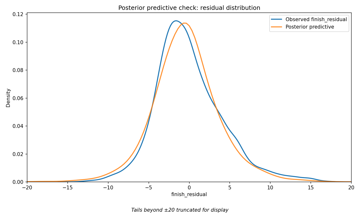
The blue line shows the actual distribution of finish residuals across all 4,871 races in the dataset. The orange line shows the residuals of the fitted model simulated by drawing from its learned parameters. If the model is well-specified, the two lines should closely overlap. They do — confirming that the StudentT likelihood correctly captures the shape of real F1 race outcomes, including the extreme values at both ends.
Holdout RMSE. The model was trained on 2014–2024 data and evaluated on the fully held-out 2025 season — a year with new regulations, new rookies, and new team compositions the model had never seen.
| RMSE | |
| Bayesian Hierarchical Model | 3.114 |
| Naive baseline (predict residual = 0) | 3.146 |
The model outperforms a naive baseline that simply predicts every driver finishes exactly where their grid slot expects. The margin is modest — F1 race outcomes contain substantial irreducible variance from safety cars, weather, and incidents that no model can predict. Beating any baseline at all on a completely unseen season is a meaningful result.
Limitations
Intellectual honesty about what a model cannot do is as important as what it can. These are not afterthoughts — they shaped decisions throughout the project.
The Verstappen Paradox. This metric measures value added relative to the starting position. Drivers who dominate from pole will naturally generate lower residuals than drivers who regularly recover from midfield. This is a structural property of the approach, fully acknowledged and discussed in the findings above.
Static driver effects. Each driver receives a single coefficient throughout their career. A 2014 Fernando Alonso and a 2024 Fernando Alonso are treated as draws from the same latent skill distribution. The model cannot capture the arc of a career — the development years, the peak, the decline.
Teammate quality. The TeamSeason Effect is estimated from the combined results of both drivers. A driver paired with a very weak teammate for several seasons may appear stronger than they are, because the car’s effect looks smaller when one driver is consistently underperforming it. This is not corrected for in the current model.
DNF classification complexity. Every retirement status string across 11 seasons was manually reviewed. The classification is rigorous, but edge cases exist — a collision caused by a mechanical failure mid-corner sits in an ambiguous grey area. The 140 rows labeled simply “Retired” were excluded rather than misclassified.
Season benchmark sparsity. The expected finish benchmark is computed within each season. Early rounds of a new season have fewer races to average over, making the benchmark noisier at the start of the year than at the end.
No circuit or weather effects. Monaco and Monza produce fundamentally different position-change profiles. Wet races introduce randomness that has nothing to do with driver skill. These are unmodeled variance sources that the StudentT absorbs rather than explicitly handles.
Sample-size fragility. Even with the 20-race minimum, drivers near that threshold carry wider uncertainty bands than veterans meaningfully. Treat the rankings of shorter-career drivers as directional rather than definitive.
Conclusion
So — after all this — who is the best F1 driver of the Hybrid Era?
On the specific metric this model uses — race performance relative to grid position expectation, controlling for car quality — Hamilton leads with 85.2% confidence over Verstappen. The model places Verstappen clearly in the elite tier, well separated from the midfield, but cannot reward his particular brand of dominance: perfection from the front generates no “Value Added on Sunday.”
The more honest answer is that “best driver” depends on what you are measuring. A model that rewards recovery and racecraft favors Hamilton. A model that also credits qualifying brilliance might tell a different story — which is exactly what the next version of this model aims to build.
What this project establishes clearly is that the uncertainty is real. Alonso vs. Ricciardo: statistically indistinguishable. Norris vs. Leclerc: a coin flip. These are not cop-outs — they are what the data actually says, and saying so is more useful than manufacturing false precision.
The one thing the model says with near certainty: the car matters enormously, and any ranking that ignores it is not really ranking drivers at all.
Where This Model Goes Next
The Verstappen Paradox is not just an interesting quirk — it points to a genuine gap in how this model defines driver skill. Fixing it properly requires rethinking the model structure, not just adding a variable.
The proposed Version 2 is a Dual-Path Latent Skill Model. Instead of one outcome variable, it uses two observation nodes that both draw from the same underlying driver skill parameter:
- Qualifying delta — how much better did the driver qualify than the car’s theoretical position? A driver who puts a 10th-place car into the 6th spot on the grid is demonstrating real skill that the current model ignores entirely.
- Race delta — how much did the driver move relative to their starting slot?
Both signals feed into one latent Driver Skill parameter. This means Verstappen qualifying 1st in a car that “belongs” at 3rd contributes a strong positive qualifying delta — giving him credit the current model cannot.
Version 2 would also introduce time-varying driver effects. Rather than one static career coefficient, a random walk prior would allow each driver’s estimated skill to evolve season by season — capturing what every F1 fan already knows: drivers develop, peak, and decline. A 2014 Alonso and a 2024 Alonso are not the same driver, and the next model will not treat them as if they are.
The goal is a model that can finally answer the question this one raises: not just who added the most value on race day, but who was the most complete driver — in qualifying, in the race, and across the arc of their career.
Built with FastF1, PyMC, ArviZ, pandas, and seaborn. Data covers the Formula 1 Hybrid Era, 2014–2025. Full methodology, code, and data pipeline available on GitHub.
Leave a Reply